Furniture Repair Bank
Reviving unwanted furniture for families in need
Skills
Product Design
User Surveys
Prototyping
Competitive Analysis
Role
Designer
Researcher
Timeline
June - August 2024
Team
3 HCDE Students
*This project was a part of the University of Washington's Human Centered Design and Engineering department's Design for Passion volunteer project.
Table of Contents
1.
2.
3.
4.
5.
6.
The Challenge
The Question
How might we redesign their website to present information in a way that allows each target audience to efficiently locate what they need?
Furniture Repair Bank is a local non-profit organization based in Seattle, Washington with a goal of reducing waste and building resiliency. Their goal is to revive unwanted furniture and provide them to families in need, which in turn addresses climate issues and promotes a sense of community.
With a growing organization and volunteer base, Furniture Repair Bank wanted to find a way to make their information clearer to the public, while also finding a solution to help streamline their communication and management workflow.
According to the Environmental Protective Agency, there has been an increase in generation of furniture in the municipal solid waste from 2.2 million tons in 1960 to 12.1 million tons in 2018, with the majority being sent to the landfills.
Solution Preview
Breaking down information
Highlighting key points
Restructured hierarchy to highlight important information and added clear call-to-action buttons.
Condensed and reorganized information, while highlighting opportunities and a volunteer's impact.
Providing clarity
Provided more clarity on information that our users wanted, and provided a chronological breakdown of what they can expect from before the shift to the end.
Prioritizing and streamlining
Prioritized content based on the user's mental model, streamlined the donation form, and integrated it to the website.
User Research
Prior Data
A previous usability test was conducted by the Furniture Repair Bank, which revealed a struggle with navigating the volunteer and donation pages. We also reviewed their Google Analytics data to identify the site's most accessed pages: volunteer calendar, donation, and volunteer pages. Finally, we collected previous email inquiries where users reported having trouble finding basic information on their website. With this information we were able to identify our two key target audiences:
-
Furniture donors
-
Volunteers

User Surveys & Card Sorting
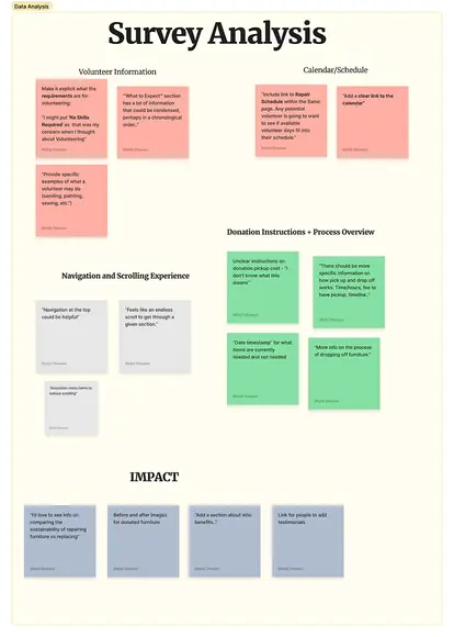
Now that we identified our target audiences, we wanted to better understand what was working and what wasn't from their perspective. To do this, we decided to conduct user surveys in addition to a card sorting activity to gauge the user's opinions on the current designs, as well as how they organized the information. We distributed these two activities to the Furniture Repair Bank's current group of volunteers and furniture donors. In total, we collected 19 responses: 11 volunteers, 7 furniture donors, and 1 potential donor.
Key Insights
We identified the following key insights that were major influencers for our design solution.
Furniture Donors
Three most important things to know:
-
Accepted items (78.9%)
-
Pickup services (52.6%)
-
Donation process (36.8%)
Volunteers
Three most important things to know:
-
Time commitment (89.5%)
-
Skills required (73.7%)
-
Dress code (31.6%)
Simply explain basic information
Users preferred to condense the extensive information and order it chronologically to better understand the process.
Emphasize what skills are required
It's critical to mention that no skills are required to ease potential volunteers' concerns.
Visuals are key
Volunteers love to see photos of the impact their work has and the types of activities they may be taking part in.
Furniture donors wanted to know what items are accepted and not accepted upfront.
Be direct with what's acceptable
Explain the process
Donors wanted more clarity on the required steps to donate or volunteer.
"We're interested in donating furniture. I couldn't find info on the website. What do you accept, and when can we drop off?"
The Designs
Narrowing the Scope
We focused on redesigning the content for the new Join Us, Individual Volunteer, Group Volunteer, Furniture Donation, and Repair Calendar pages based on our target audience's feedback during the research phase. Due to some limitations on Squarespace, we had to modify several of our designs to adapt to its available features. We were also intentional with avoiding the CSS Editor as we wanted to ensure that our clients would be able to easily maintain and update their website without any coding or HTML experience.
Adapting our Designs
We wanted to make sure that we maintained the Furniture Repair Bank's branding, so we were intentional with standardizing our choice of colors, typography, and images throughout our designs. Per our client's request, we directly created these final prototypes on their Squarespace website. This allowed us to provide a deliverable that would be usable immediately for our clients, as they did not have a designated team for their website's maintenance.

Iterations
Negative Space
The original design displayed information on how to sign up for a volunteer as a numbered list; however, this created unnecessary negative space. In our revision, we wrote our sign-up instructions in paragraph form instead.
Iterations
Carousel Post
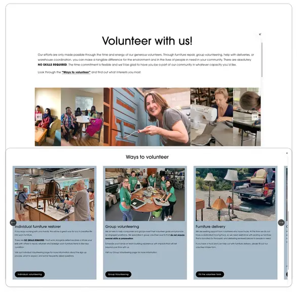
We initially organized the different ways to volunteer on a carousel post. After critiques from our stakeholders and mentor, we decided to re-organize this information to separate cards instead to minimize the amount of waiting or scrolling required by the user.
The Final Solution
Volunteer Umbrella
The creation of a new umbrella page was designed to show users the different ways volunteers can get involved and redirecting them to find the appropriate page for more information. As users complained about having a difficult time digesting the overwhelming amount of information and the large amount of scrolling, we condensed the information and re-organized them onto their respective pages.
Individual Volunteers
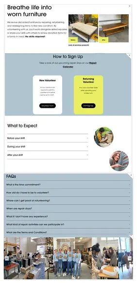
Our newly added, "Individual Volunteer" page provides more clarity on information that our users wanted, such as the types of projects they could partake in and the actions required to sign up for a shift. It also provides a chronological breakdown of what they can expect from before the shift to the end. Finally, we added in a Frequently Asked Questions section to address many of the common questions users had.
Repair Calendar
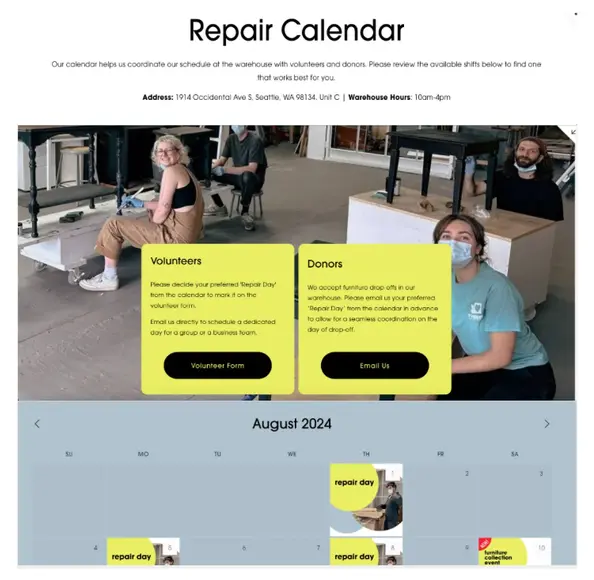
Since many users struggled to find information about the warehouse, we highlighted the most important pieces of information on top: warehouse hours and warehouse location. We also added clear calls-to-action buttons based on the user's intent to redirect them to the appropriate next steps.
Furniture Donations
To address users struggling with missing and scattered information, we added and prioritized content based on the user's mental model. We focused on the following: Accepted items, Pick up services, Donation process, and FAQs. We streamlined the lengthy donation form from 13 fields to 3, directly integrated it to the website, and clarified what items aren't accepted upfront to reduce donation rejection communication.
As we designed all of our final prototype directly on Squarespace per our clients' request, I am unable to provide a testable prototype here at this time. But please take a look at our final designs below or through this FigJam link.
Takeaways
As my first project, it was a little intimidating applying the skills I've learned to a real-world setting. From working directly with stakeholders to communicating with my design team, I had the opportunity to sharpen my skills and also learn new ones along the way. Throughout the process, I found myself truly enjoying tackling interesting challenges and working alongside my teammates to create a meaningful project for our clients.
I quickly saw how valuable communicating closely with the stakeholders can truly be. By understanding their skills, resources, and expectations, we were able to adjust our deliverables to a prototype they would be easily implemented into their system. Even though we had originally planned to create all of our final prototypes on Figma, our team decided it would ultimately be more beneficial for our stakeholders to create it on their Squarespace instead for ease of implementation.


